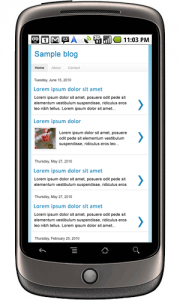
Blog owners who want to reach out to people who frequently use their mobile gadgets should seriously consider making their sites mobile-friendly. You need to do this as soon as possible if you don’t want to reduce the number of your regular readers.  With a growing number of people now opting to use their mobile devices to browse the internet, this should be made a priority. If you want to be sure about this, you can use Google Analytics to check the number of people accessing your blog from a mobile device. When a keep same which SPF! blog to find out for yourself how it looks in a mobile gadget. Use Google’s How to Go Mo then go to the Mobile Meter page and enter your website address. An image will next appear showing how your blog will look in a mobile device. There are certain aspects of a blog that you need to modify in order to have it display better in a mobile gadget such as an iPad or smartphone. Text should be made shorter and the images have to be in the right size without requiring people to zoom in and out on your content all the time. When you are able to adjust them, you can be sure your readers will have a fast and easy access to your site. You have an option to build a separate website exclusively for mobile devices. This has its own advantages being easy to do, cost effective and requires no technical skill. But there are also downsides particularly as you will need to update two sites every time. Perhaps the best option is to use a mobile-optimized theme that instantly displays a mobile version of your blog when a person visits your site via a smartphone or tablet. Image via blogger